A / Natural Sweep
Generous turns and a flowing middle. Closest to the existing mark, with the uneven transitions removed.
A fuller path gives the S more visual weight.
Download option A SVG →
Sendero / Curve studies
Four versions of the S, redrawn with smoother joins. Each keeps the same straight, matching-width openings, square proportions, colors, and uninterrupted lettering.
Javi selected A / Natural Sweep. It is now the master logo used across the website and brand kit.
Generous turns and a flowing middle. Closest to the existing mark, with the uneven transitions removed.
A fuller path gives the S more visual weight.
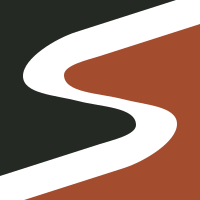
Download option A SVG →Fuller land shapes and a tighter, rounded S. A compact, balanced option beside the heavy lettering.
The tighter middle gives the path a slightly lighter feel.
Download option B SVG →Wider movement across the square, with a more expressive change of direction.
The stronger sweep draws more attention to the symbol.
Download option C SVG →Compact, gentle turns with a calmer rhythm through the middle.
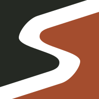
Its restrained movement has less of the original broad sweep.
Download option D SVG →I recommend A / Natural Sweep for the closest refinement of the selected identity, or B / Rounded Flow for a more compact S.
Open the side-by-side comparison →